Illustration
A set of my favorites illustrations, a combination of personal projects and commissioned work.
Illustration
A set of my favorites illustrations, a combination of personal projects and commissioned work.
Illustration
A set of my favorites illustrations, a combination of personal projects and commissioned work.

Kaching Store App Version 2.0
Running on both iPhone and iPad, Kaching Store app is a mobile POS designed with sales assistants and end customers in mind. Allows access to meaningful product and customer data.
UI / UX / IxD


Problem Statement
The Idea
The current version of the product (V.1) isn't scalable, it was tailored for a client in specific. It doesn't meet proper user experience standards (iOS), and it lacks some visual appeal.
Build an intuitive, flexible, forward-looking app (V.2) for managers and sellers, considering fundamental aspects such as the seller's journey, needs, and expectations of clarity in usability.


Conducting Interviews
Series of interviews were conducted with the objective of finding the areas that were most valued by the users, at the same time emphasizing the efforts of improvements in those which users find problems.
First take on the Information
Architecture for the M.V.P

Minimum Viable Product
The first step on the creation of Version 2.0 was to create an M.V.P whit just enough features to satisfy early customers and to provide feedback for future product development.
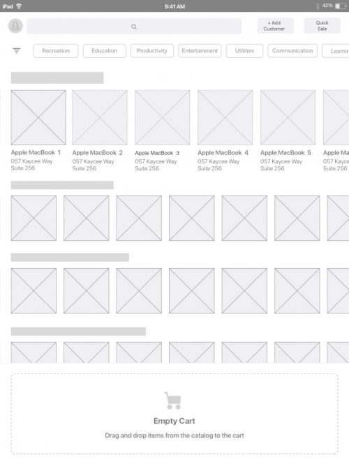
Low and Hi fidelity Mockups & Prototypes
I created a set of Low and Hi fidelity mockups and prototypes allowing me to turn the design ideas into something more tangible and testable.
This step was key to collect feedback at an early stage.
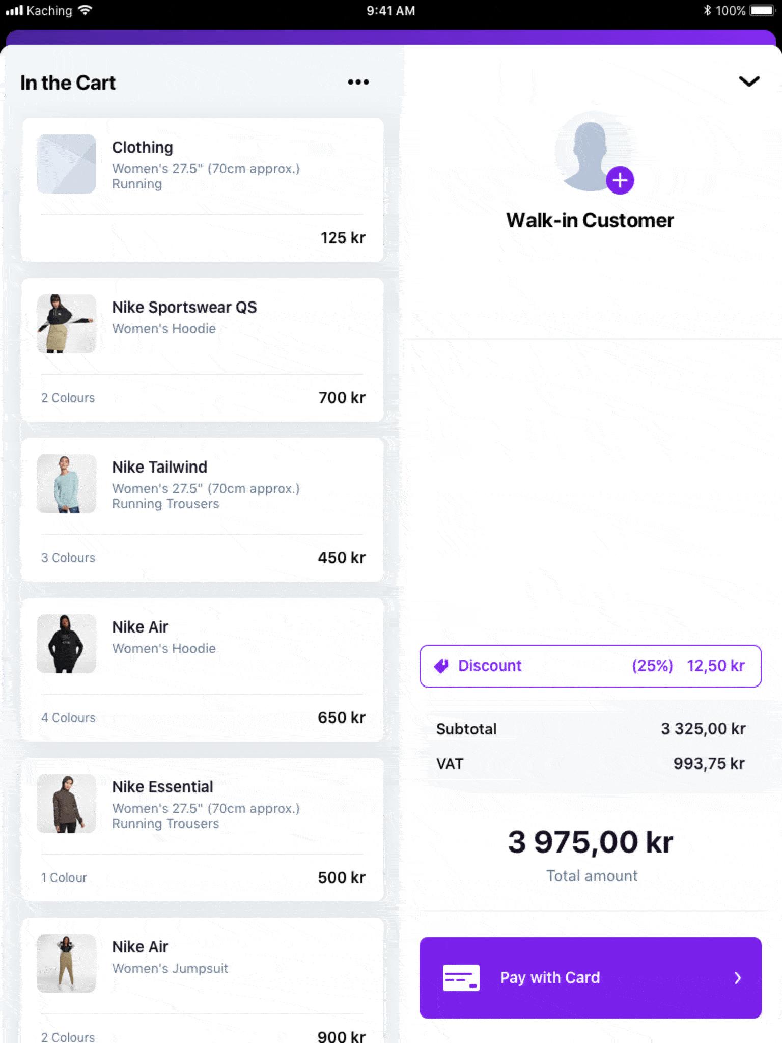
In this example, a flow where the User could add an item to the Cart and proceed to the Checkout screen, this would be achieved by just simple actions.
Creating a new customer and adding it to the current sale.

Building a Library of Components
Consistency and cohesion are essential when creating enchanting experiences for users; this allows
the recognition of elements throughout the product, creates patterns of behavior and prevents the user from having doubts when new screens are presented. The system would help saving time for developers
and designers since the components are reusable and allow them to focus on what is most relevant
in product design, solve problems for users.

Core Metrics (Vertical Rithym)
& Color Palette

Set of cards and specifications
for handoffs

Custom built Pop-overs
using iOS components

Grid system for multiple
screen sizes.

Text styles for both light and
dark backgrounds.

Text fields, buttons and
toast notifications.
Hi-Fi Mock-ups
Here some of the screens showing the login, product catalog, product groups, checkout, and product detail view screens.


The Impact & Benefits
The new version has reflected only positive changes; this can be seen in the indicators presented below. The users have shown great satisfaction and a high level of engagement. Also, suggestions and opinions were collected from our users; most of them regarding features that users expect to have in a more advanced POS, however, some of them are part of the product roadmap, and these features will be implemented shortly.
Happiness
Satisfation, likelihood of recommendation
V.2
Engagement
How much a user is using the solution
V.2
Adoption
Users adopting the product
V.2
Retention
How many users stick around
V.2
Task Success
Time to task completation
V.2